Project Description
This project was to teach us how to uncover patterns and connections with self-tracked data. Students were to track two week’s worth of data about things that spark our curiosity in correlations. I decided to track my hourly activities, sleep schedule, and screen time. We were then asked to create a visual that helps show the results of our findings.
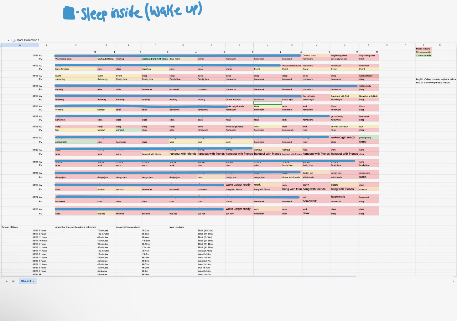
Data Collection
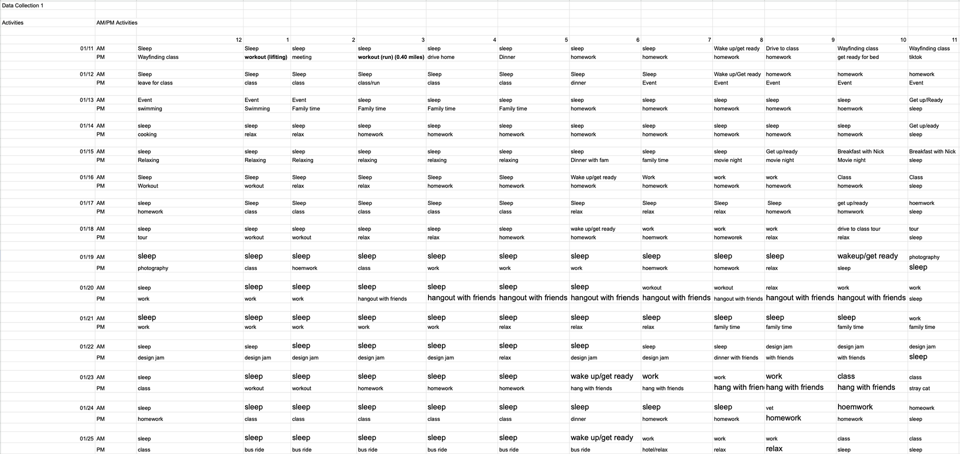
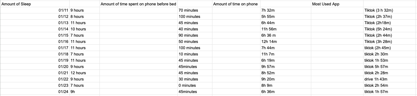
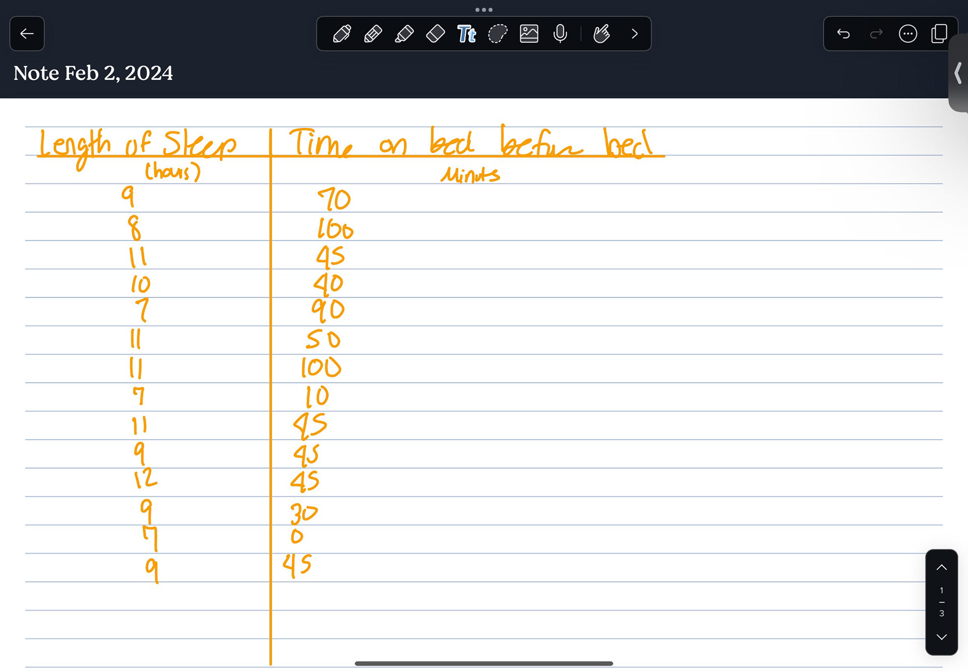
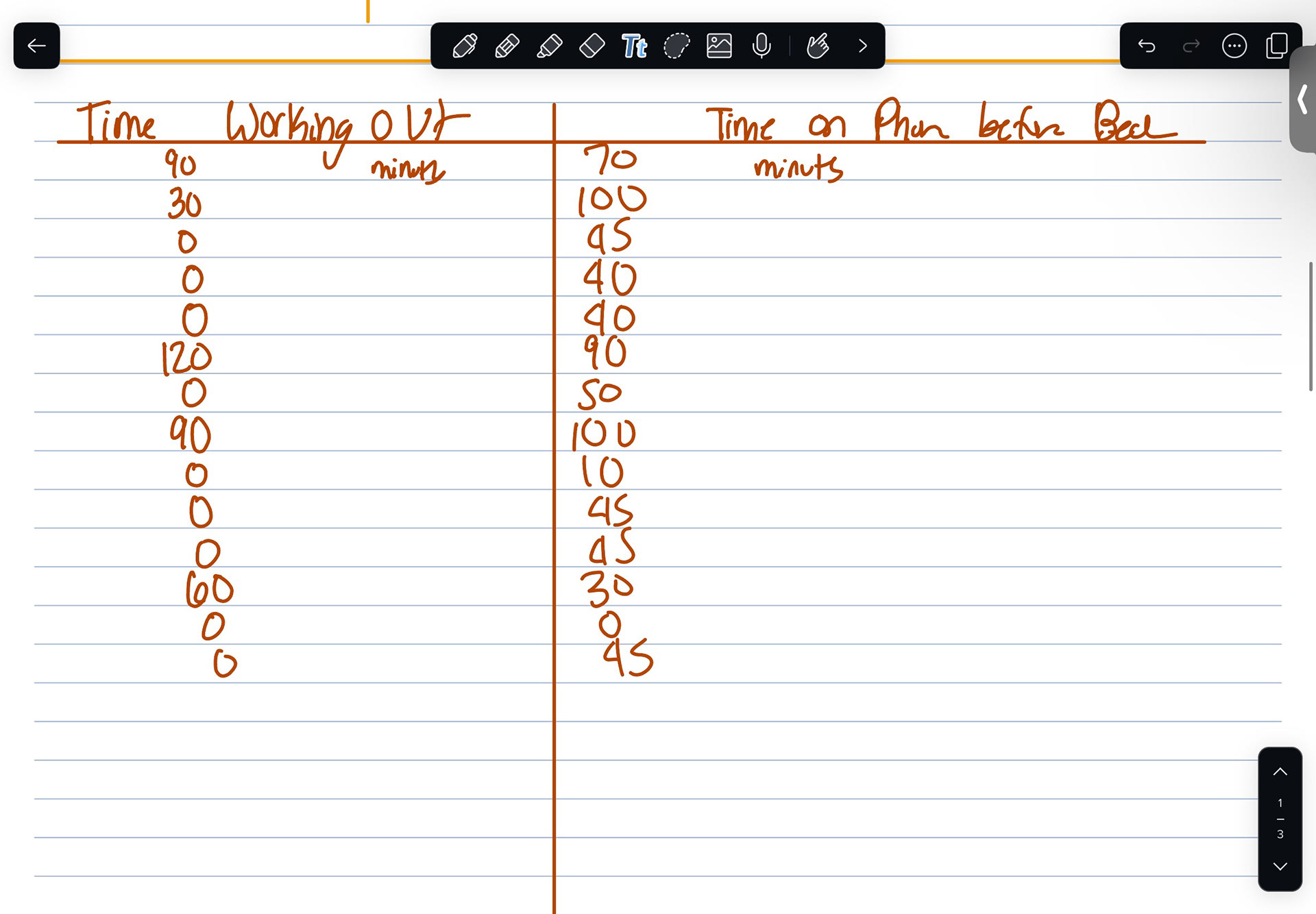
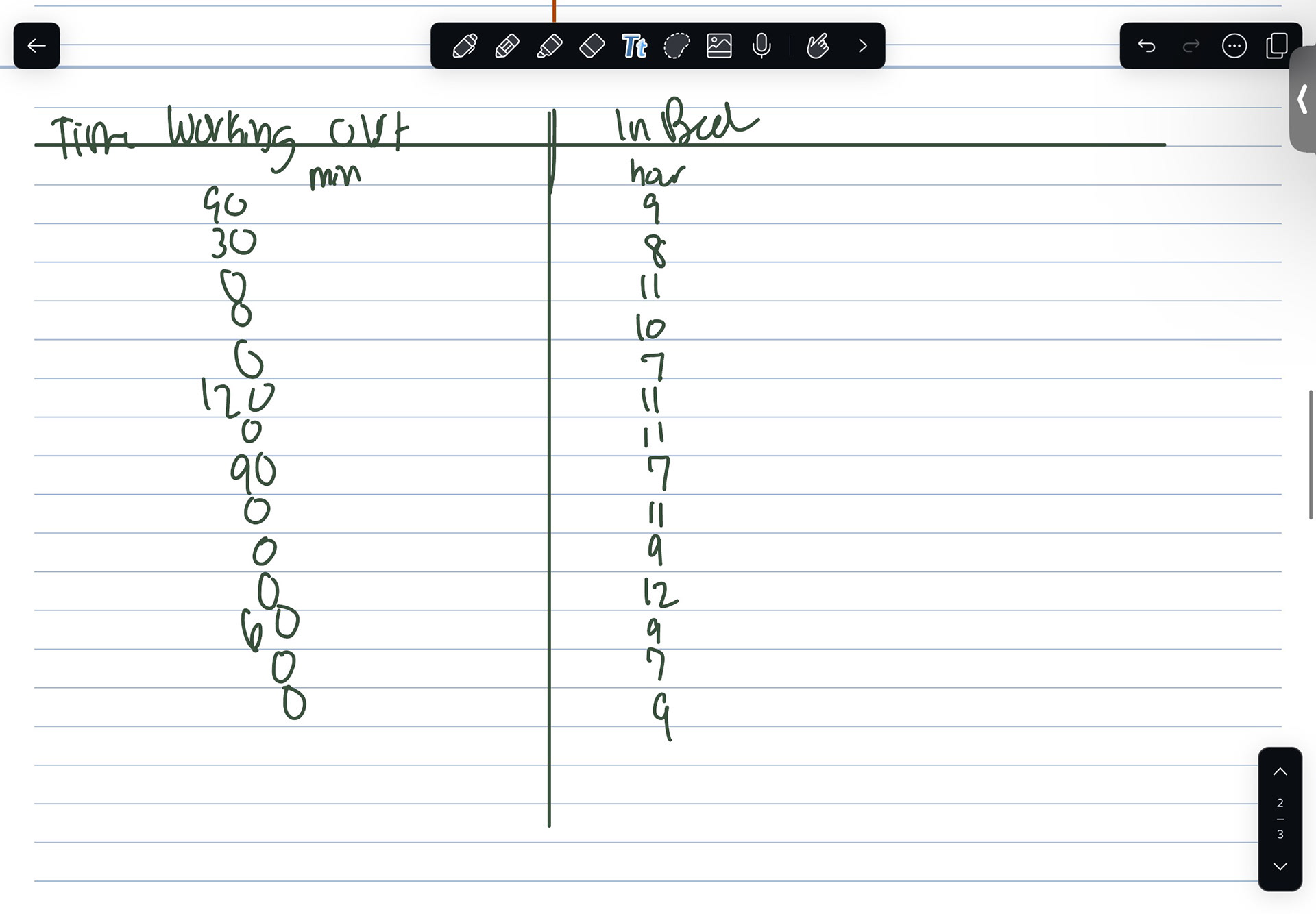
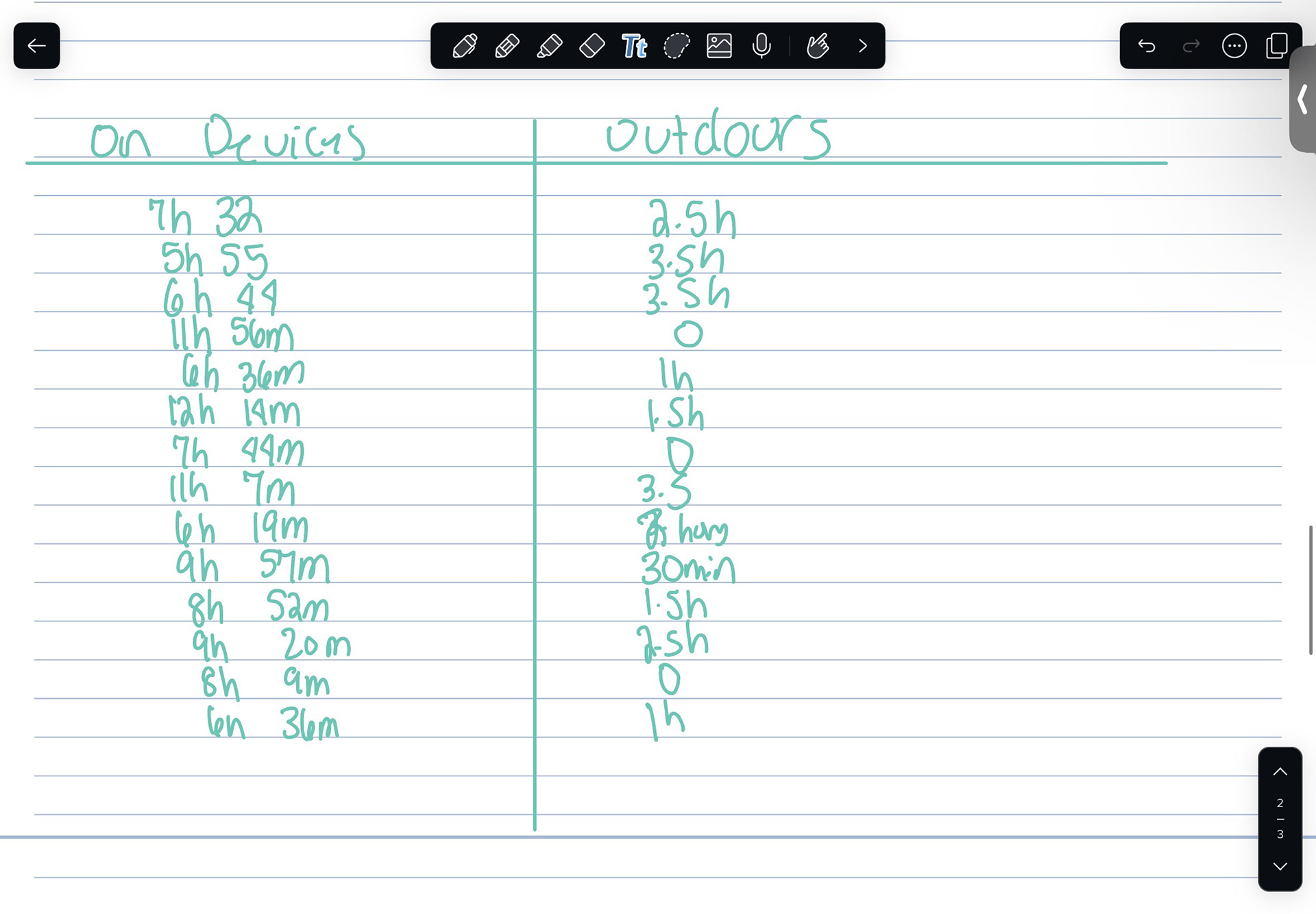
Every night I would reflect on what I had done for that day and where the activity took place to collect the data for my hourly activities and documented it into a google sheet. To collect data about my sleep and app usage, I used my phones screen time tracker setting across all of my electronics.
Things I was looking for
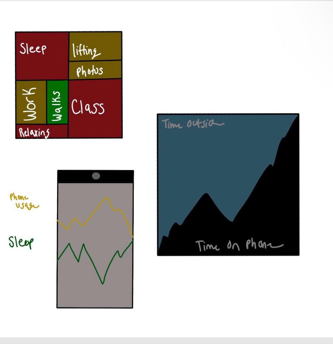
- time spent outside compared to inside
- sleep schedule
- hourly activity
- electronic activity
Data Analysis
When first looking for initial observations, there were no immediate patterns that stood out to me. It was not till I sat down and drew on my data till I was able to see connections.
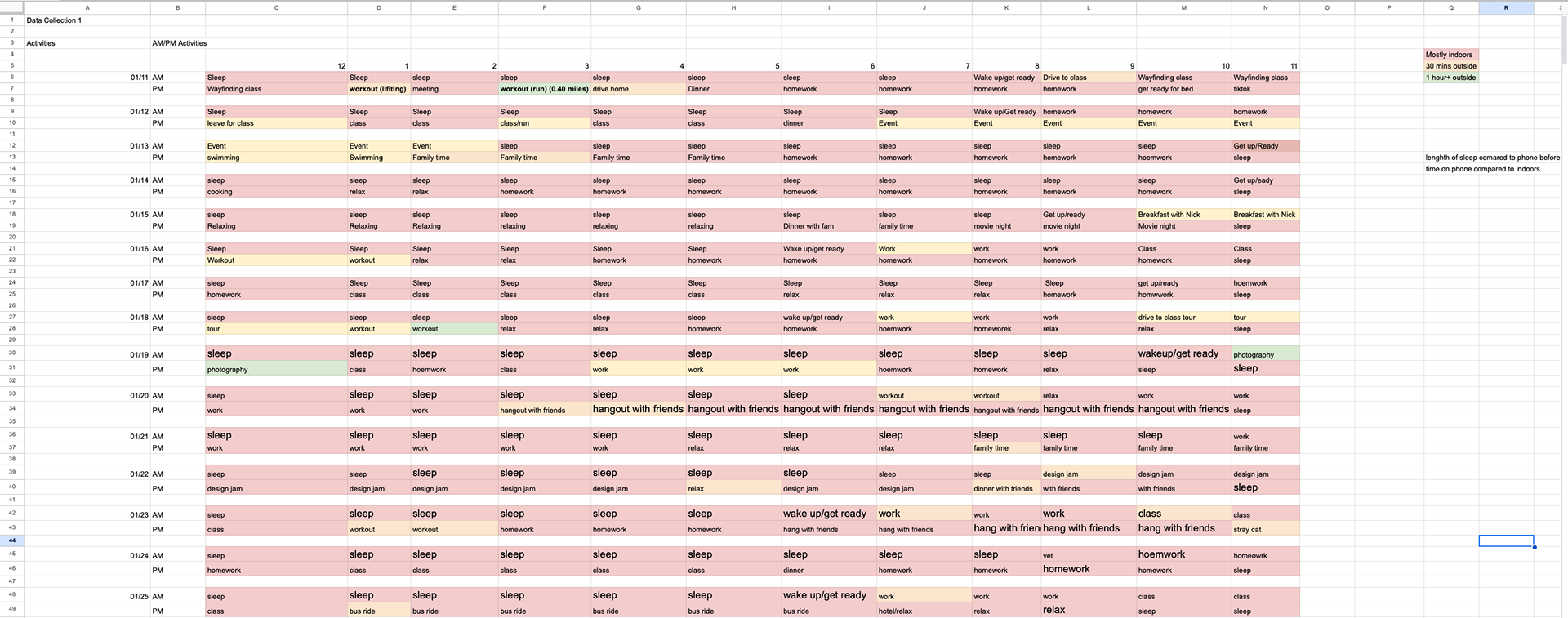
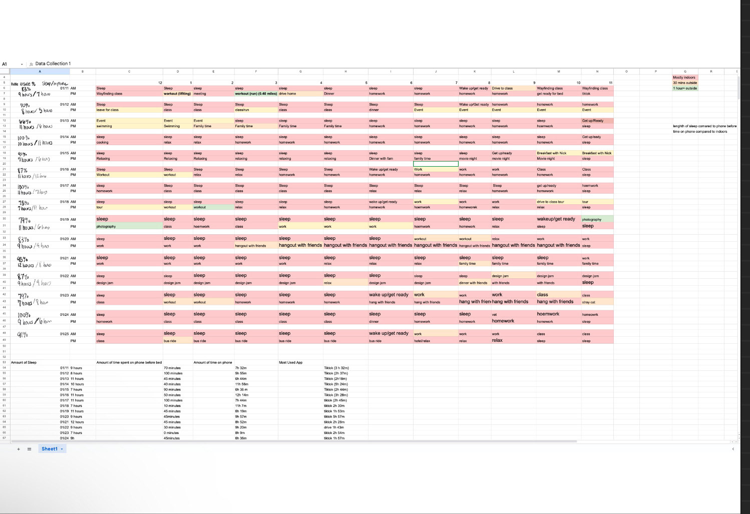
My findings were very hard to comprehend. I consider myself an outdoorsy person and I find importance in spending as much time outdoors as I can, but I saw I spent most of my time indoors. I found that various activities were done both indoors and outdoors. For this project, I decided to focus only on hourly activity and location. I wanted to find a way to visualize how much time I spent indoors and what activities prevented me from being outdoors. k;'l,
Design Process
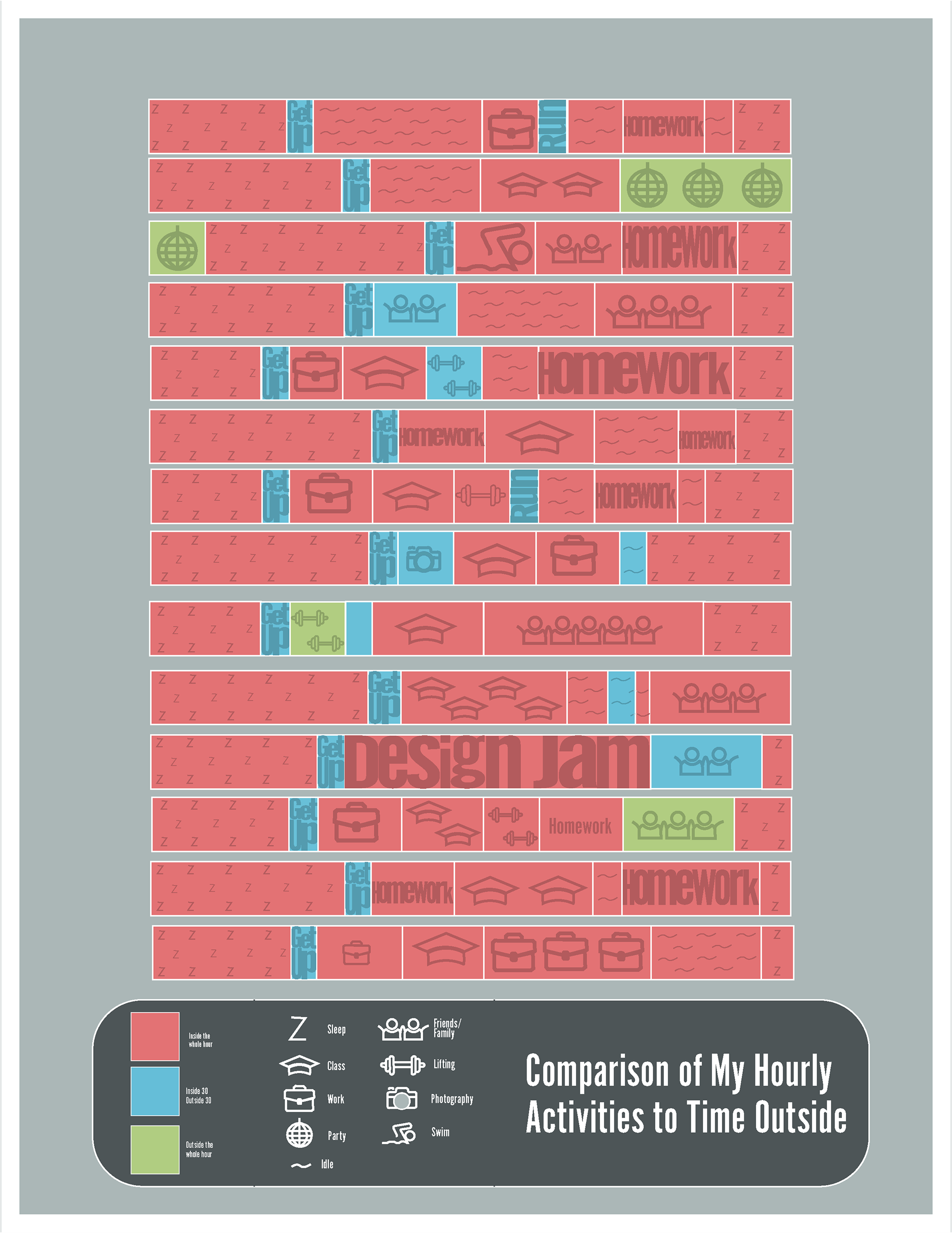
To begin my process, I explored different types of visuals for data and played with various concepts.
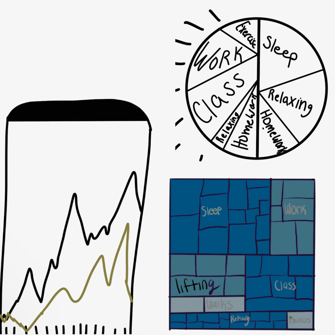
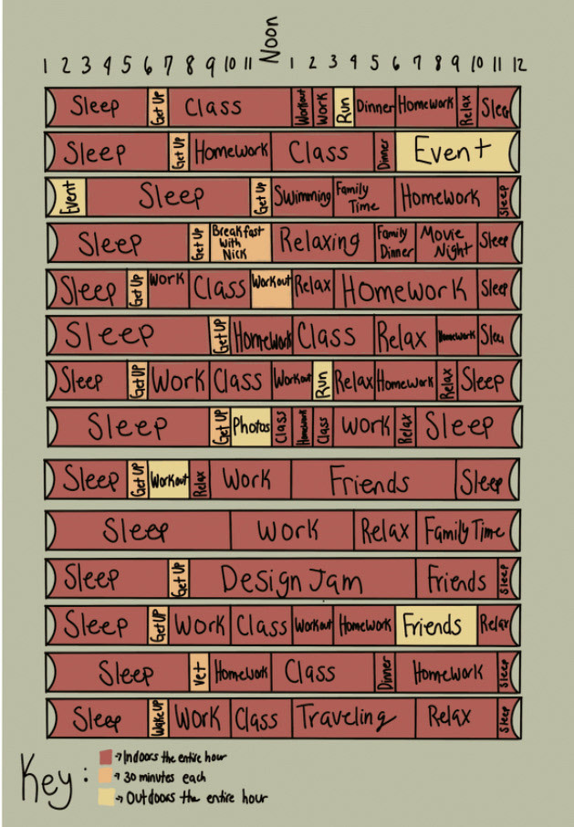
The version above is the track my professor and I decided would be the most interesting way to take this project. We discussed using icons, a mix of icons/words, better colors, including dates, etc.
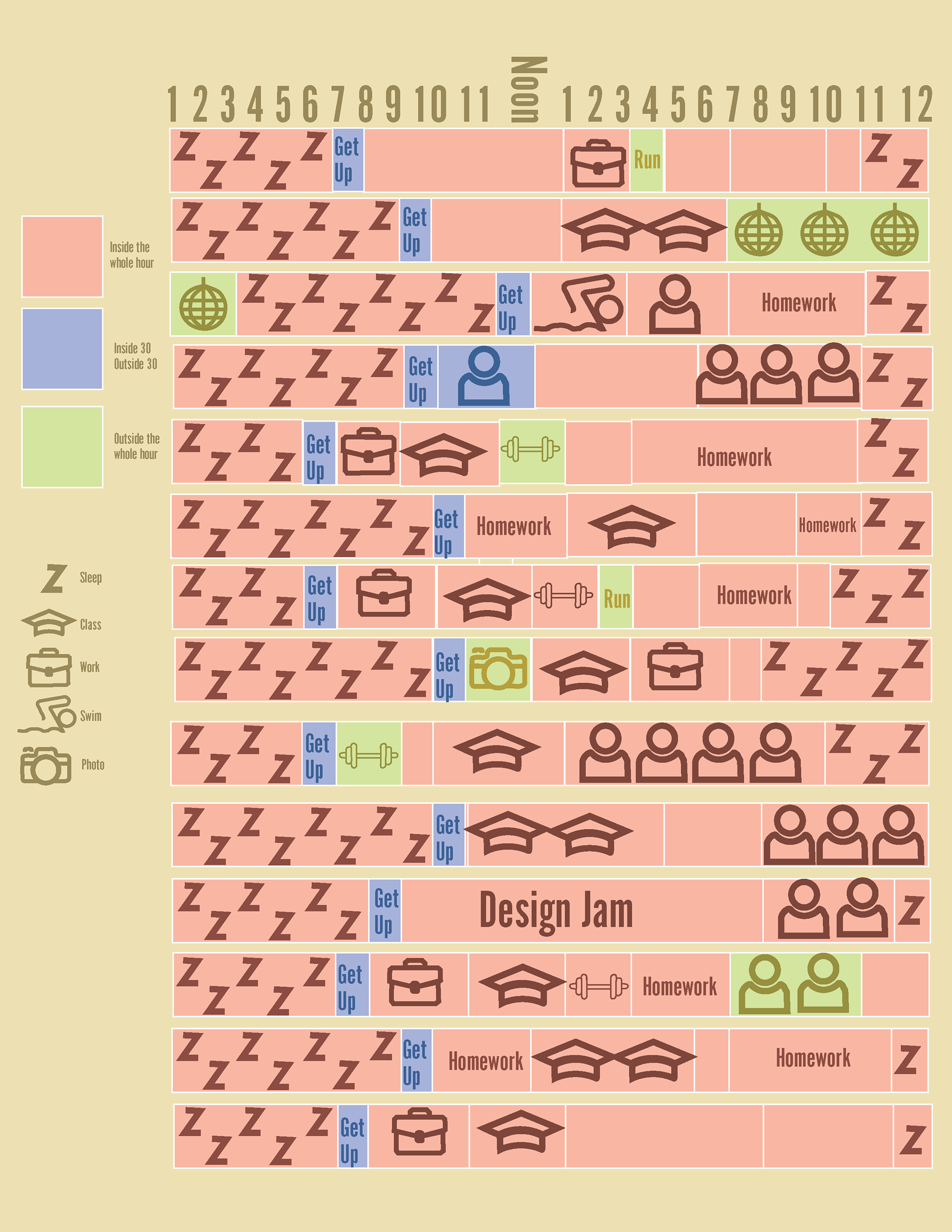
Shrink overall graph, add key to the bottom, try to make the "z's" into a pattern.
Adjust colors, make icons look part of the same family, make words look like an icon (fill the space), find a pattern like sleep for an "idle" state, have the icons size represent level of focus/activity rate.
Swap background colors with bottom box.
Continue to make icons look similar, keep working with the word homework, even out the icon key, play with title words, add dates.
Notes on aligning the dates to the right, create "Homework" to relate to Paul Scher's work, work on line spacing in the bottom box, final icon adjustments, make typefaces match.
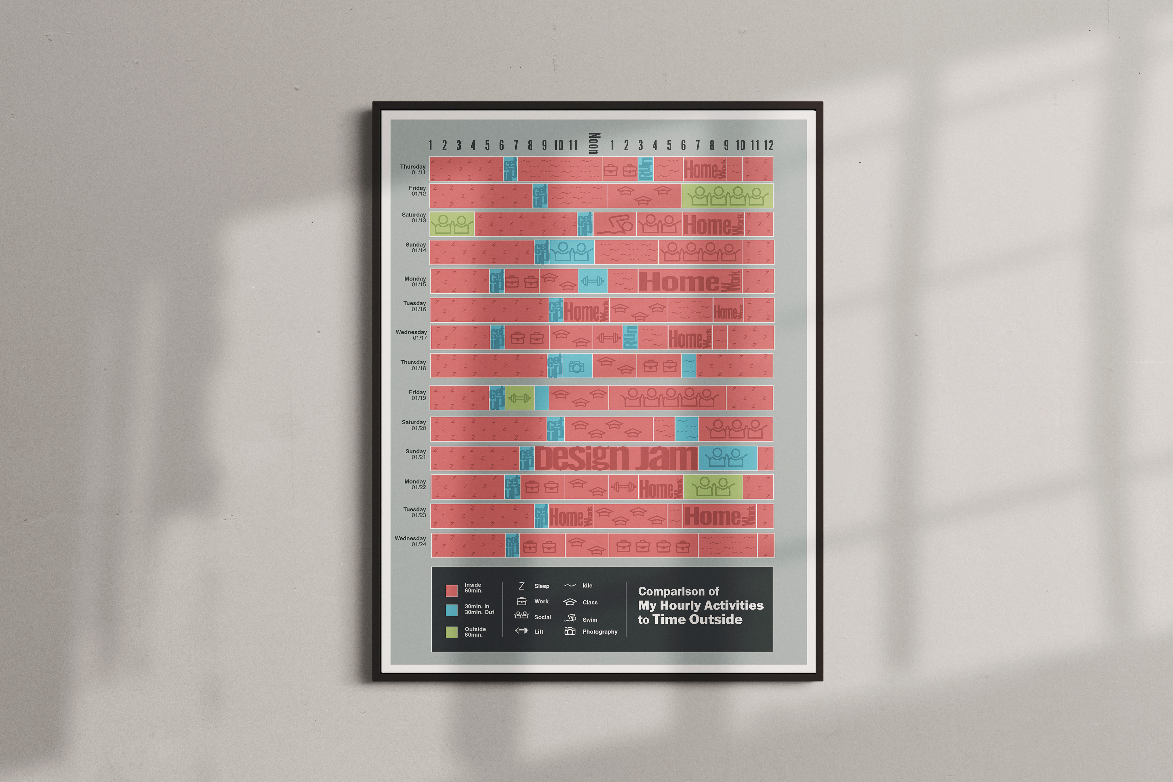
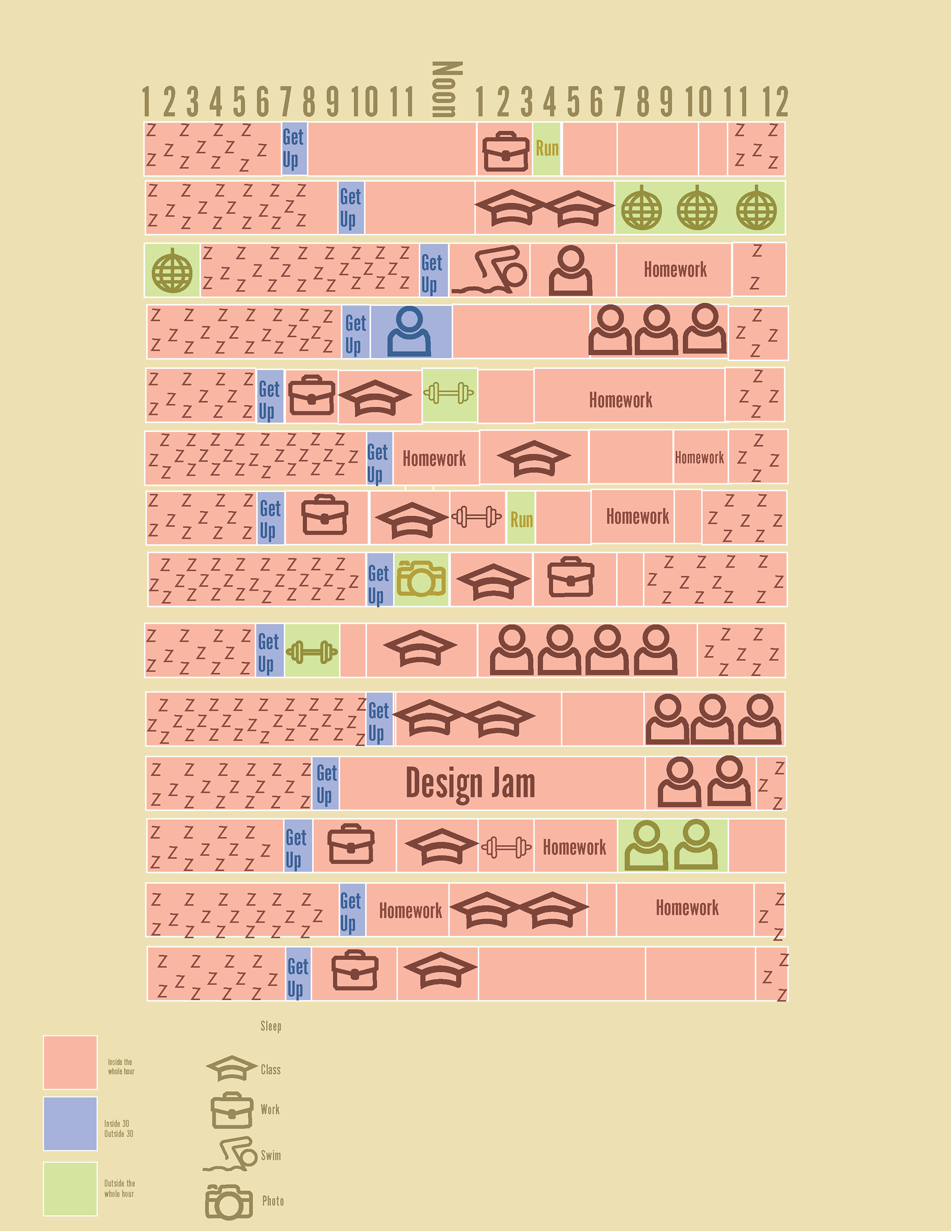
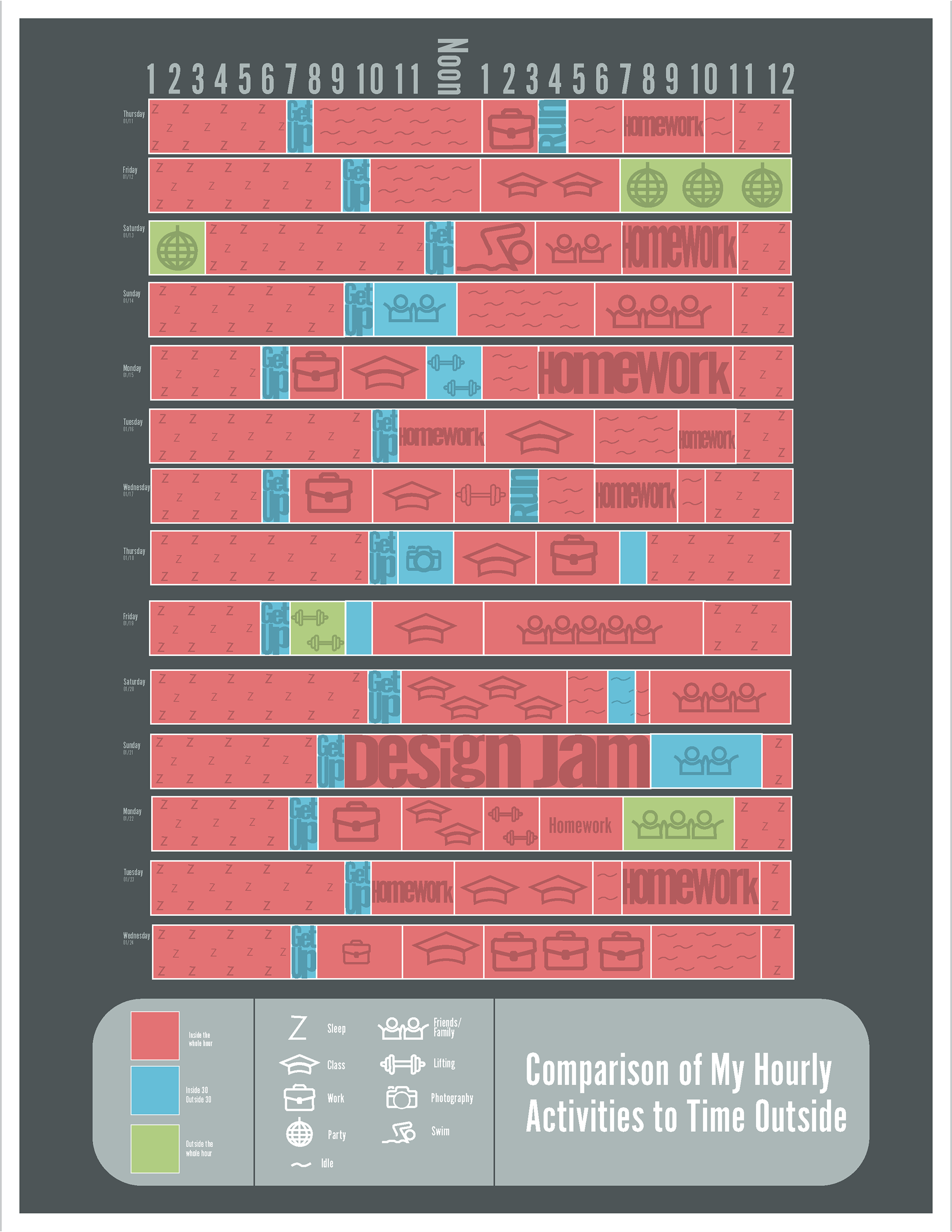
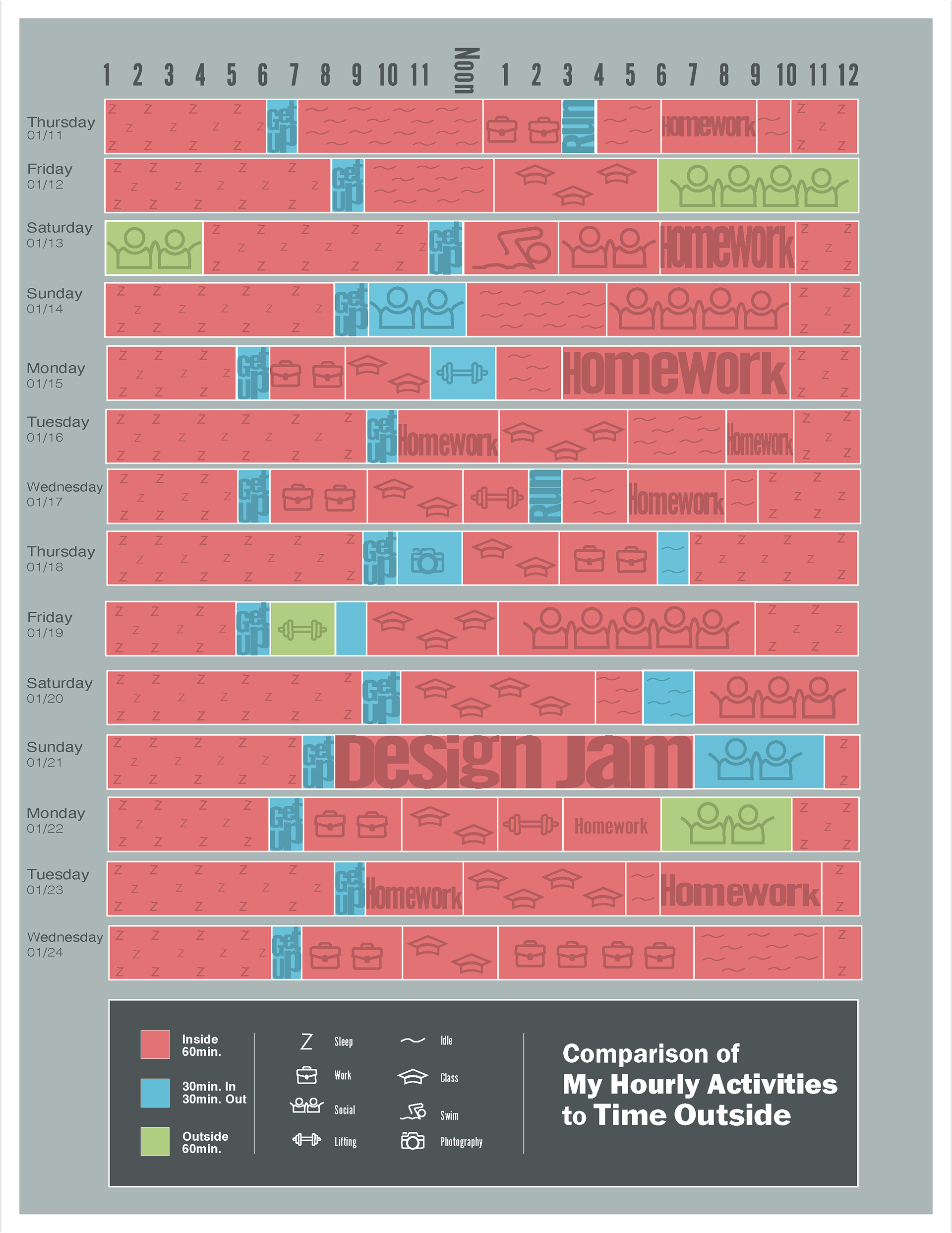
Final Design
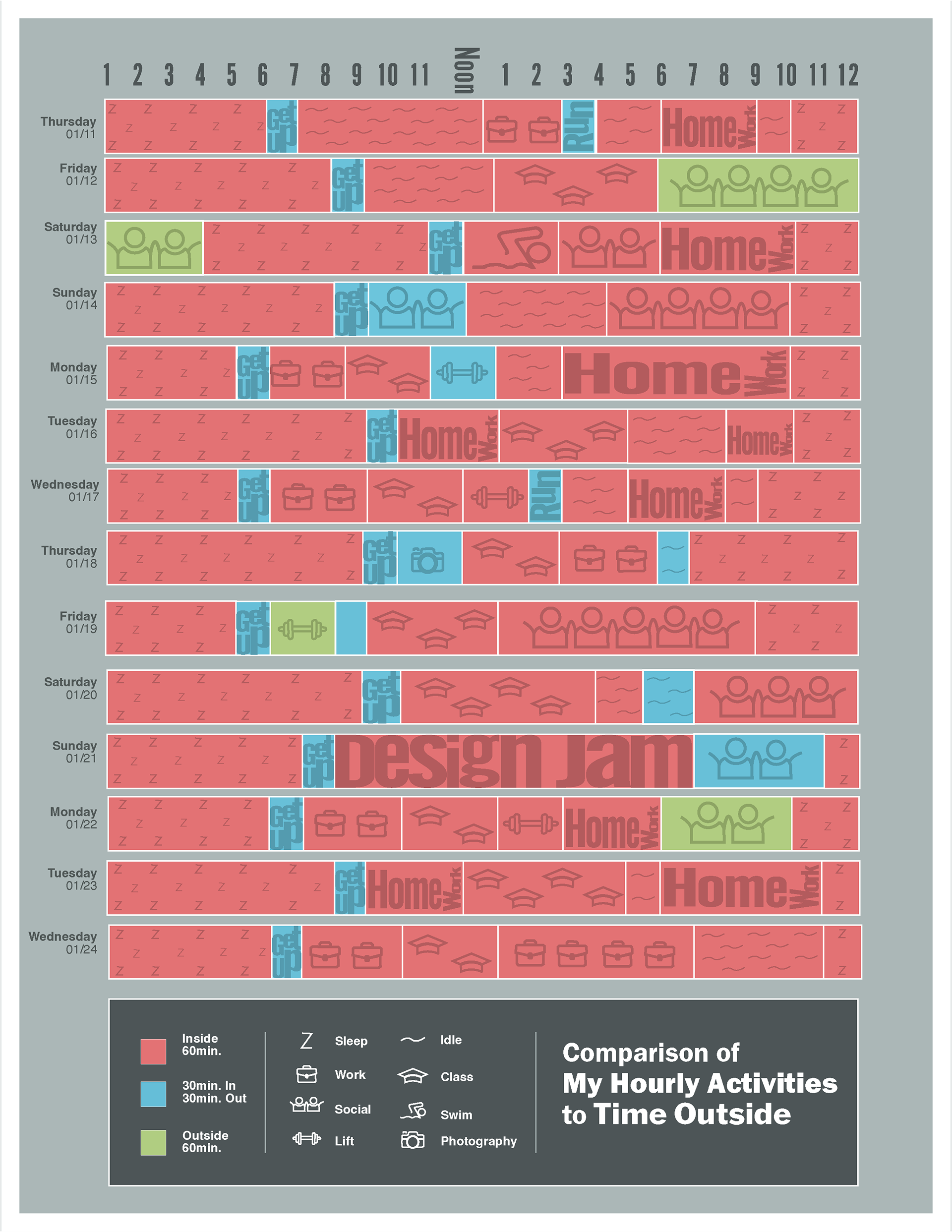
This visual representation shows the list of hourly activities that I partook in. Each activity shows via color, if the activity took place outdoors, indoors, or both. The size of the icon/words show how much effort was put into each task. The greater the size, the busiest I was completing the task. My design clearly shows that I spent the majority of my time indoors.
Reflection
Challenges: I had many challenges for this project. I struggled to analyze data and to create a cohesive symbol set. With the help of my professors guidance and encouraging classmates, I was able to create a work that I am proud of. I researched various types graphs that could be used to express my data, researched artisits that used words as gaphics/icons, and ideated.
Learnings: I learned how to take data and find ways to make comparisons even if it is difficult. Sketching on top of data is an amazing way to overcome this issue as well as including color. I also learned how to turn text into outlines to create the effects of words turning into icons. There are many ways to visualize data and this was the best way to represent my work.
Future Directions: This data was taken during January, during the coldest weeks we saw over the 2023-2024 winter. I think it would be very interesting to compare to a much warmer two weeks to see how much time is spent outside and the different types of activities that are occurring seasonally. I think it would be interesting to see my time be spent more outside and how indoor activities would turn to be outdoor!